
You built an amazing smart home. Presence detection, scenes for every mood, a dashboard with live graphs you’re genuinely proud of. And your family still flips the light switch.
I know, because I lived it. Whenever I have friends over, they love the smart home stuff — the lights that follow you, the “movie mode” that dims everything and fires up the TV. But the dashboard I’d spent a whole weekend polishing? I once watched my family stand in front of the wall tablet, tap the wrong thing twice, sigh, and hit the light switch next to it. That sigh taught me more about dashboard design than any tutorial ever has.
Here’s what I eventually figured out: I wasn’t designing a dashboard, I was designing a trophy. It showed off everything my smart home could do, when it should have answered the only question that matters — what does my family need to touch, right now, without thinking?
These are the five rules I rebuilt around. They’re the difference between a dashboard that’s admired and one that’s used.
Rule 1: It has to beat the light switch
The light switch is your competition, and the light switch is fast. It’s always in the same place, it works every time, and it requires zero thought. If turning off the kitchen lights on your dashboard takes more taps than the switch takes steps, the switch wins. Every time.
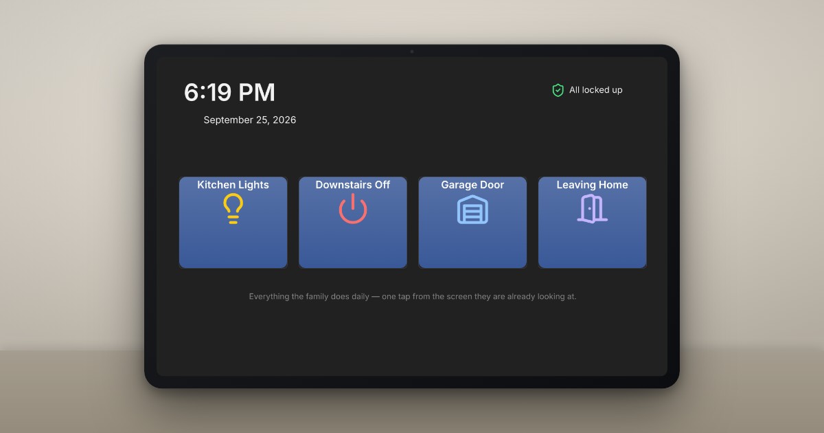
So count the taps. Anything your family does daily should be one tap from the screen they’re already looking at — not behind a submenu, not on page two. My kitchen tablet’s top row is exactly four buttons: kitchen lights, all-downstairs off, the garage door, and the “leaving the house” scene. That row gets used more than everything else I’ve ever built combined.
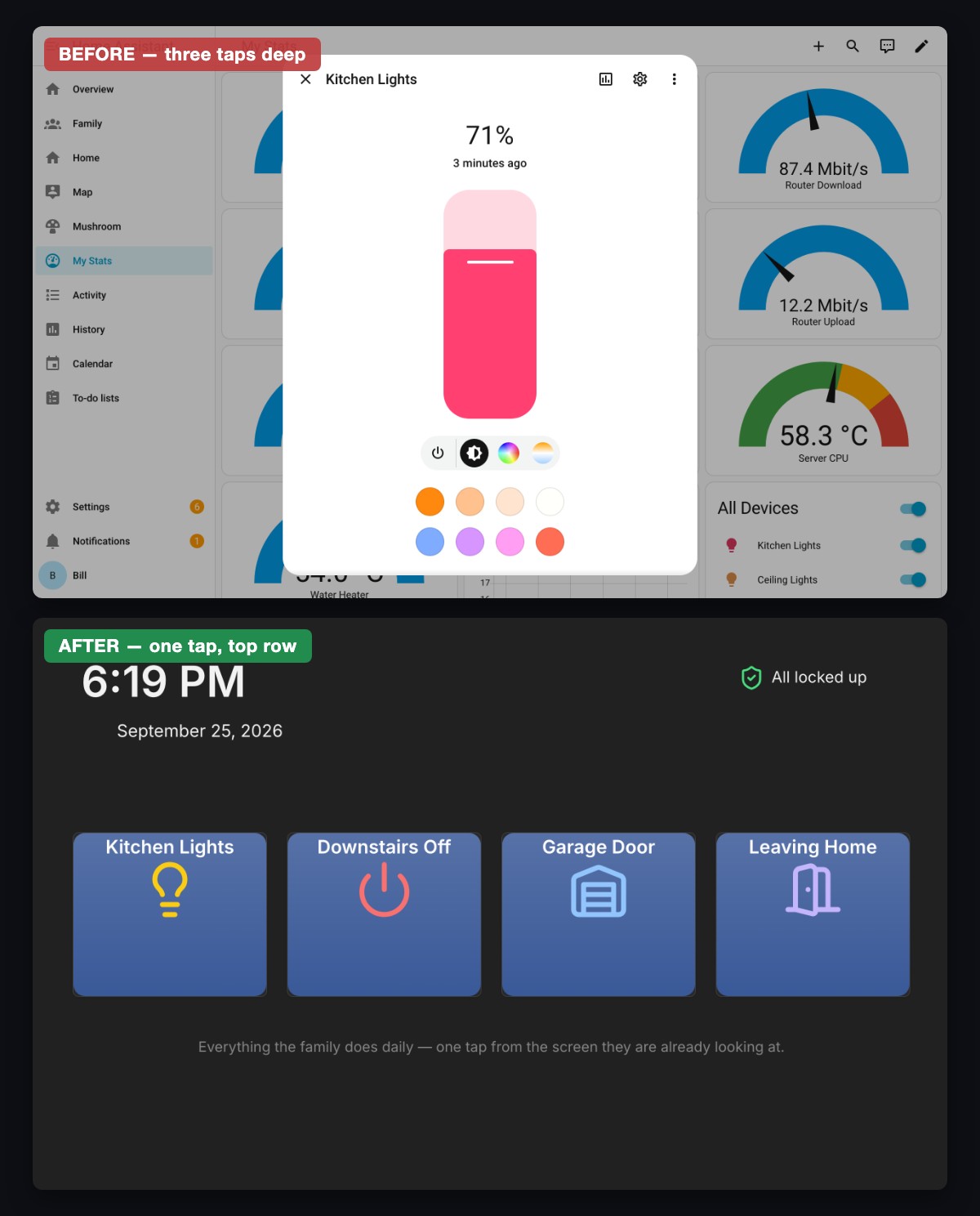
Before: the kitchen lights are behind a tab, then one of twelve identical tiles. After: the four things we actually do every day, one tap from the screen that’s already on.
Rule 2: If it needs a manual, it failed
Nobody in your house will attend the training session. There is no onboarding meeting for a dashboard — it either explains itself in half a second, or it gets ignored forever.
That means:
- Words beat clever icons. An abstract icon you understand isn’t navigation, it’s a secret handshake. “Kitchen” written under the icon costs nothing.
- Buttons should look like buttons. If it’s tappable, make it obviously tappable. If it’s just information, make it obviously not.
- No mystery states. A toggle that shows on should make it obvious what “on” means — a lit bulb icon and a color change, not a subtle border you have to squint at.
The test I use: could a houseguest use it without asking you anything? If the answer’s no, simplify until it’s yes. (Rule 2 is also why I stopped hand-crafting cryptic icon grids — but more on tools at the end.)
Rule 3: Design for 6 a.m., not for the demo
Here’s the trap: we design dashboards in demo mode — sitting comfortably, fully awake, showing a friend. But your family uses them at 6 a.m. with one eye open, or with both hands full of groceries, or mid-argument with a toddler about socks.
Design for the worst-case user, not the showroom:
- Big targets. Half-asleep fingers miss small buttons, and every miss costs trust.
- High contrast, readable at an angle, because nobody stands square in front of a wall tablet.
- The important stuff above the fold. Scrolling is a demo-mode behavior. At 6 a.m., if it’s not on screen, it doesn’t exist.
Rule 4: Show answers, not sensors
My old dashboard had a beautiful grid of gauges — humidity in four rooms, router throughput, the works. You know what my family wanted to know? Is the garage shut. Are all the doors locked. Is everything off. Three answers, not thirty readings.
Your smart home collects data; your dashboard should deliver verdicts. Instead of eight lock and door sensors, one status that says “All locked up” — and only turns red when something needs attention. Boring? Absolutely. That’s the point. A family dashboard should be boring the way a car dashboard is boring: glance, understand, move on.
Keep your graphs — I’d never take your graphs — just give them their own nerd page that the family never has to see.
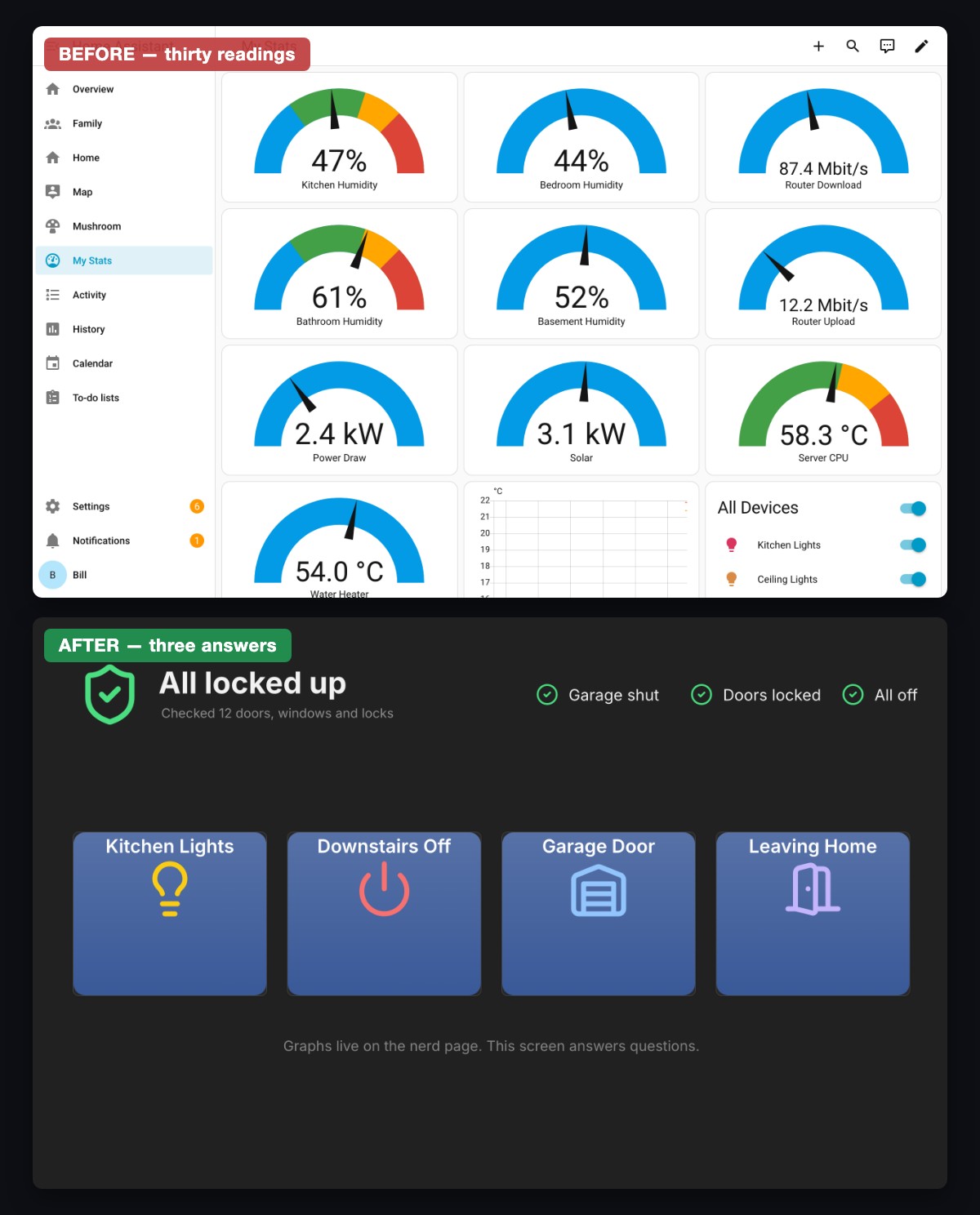
Before: twelve readings, and still no answer to “is the garage shut?” After: one line that answers it, and goes red only when something needs you.
Rule 5: The right screen in the right place
One dashboard for every device and room is like one remote for every TV in the neighborhood. Context is everything:
- The kitchen tablet gets kitchen controls, the whole-house glance row, and whatever the family checks while making coffee (weather, calendar).
- Phones get the away-from-home stuff: locks, cameras, “did I leave the heating on.”
- The bedroom screen gets a night-friendly dark layout with exactly what bedtime needs — and nothing that glows.
When the screen in front of you matches the decisions you make standing there, the dashboard stops feeling like software and starts feeling like part of the house.
The scoreboard that actually matters
Here’s how you’ll know it’s working: the light switches get lonely. A few weeks after my rebuild, I caught the same family member who sighed at my trophy dashboard walking up to the tablet, tapping “movie mode,” and walking away like it was the most normal thing in the world. No manual, no training session, no sigh. That — not the weekend of polish — is the demo I’m proudest of.
Design for them, not for you, and the rest follows.
If you’re ready to rebuild yours, here’s the honest shortcut: these five rules are ten times easier to follow when moving a button doesn’t mean fighting a config file. Stop wrestling with YAML — visit dashable.app and build a dashboard your family will actually use, free.