
“Why not just use the built-in editor?”
It’s the first question everyone asks about any Home Assistant dashboard tool, and it deserves a straight answer — not a sales pitch. I’ve built dashboards all three ways: stock Home Assistant, the full HACS custom-card rabbit hole, and Dashable. Each one is the right answer for somebody. This post is me being honest about which somebody is you.
The three routes, in one breath
- The built-in editor: free, always there, improving every month. The grid arranges everything for you — which is both its superpower and its ceiling.
- HACS custom cards: free, community-built, endlessly powerful — and you pay in time, YAML, and the occasional broken dashboard after an update.
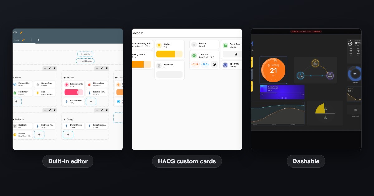
- Dashable: a paid drag-and-drop builder that does the advanced stuff — freeform placement, visual logic, multi-screen control — without the YAML.
Now the honest version of each.
Route 1: The built-in editor — better than you remember
If you last touched Home Assistant’s dashboard editor a few years ago, it deserves a fresh look. The Sections view brought real drag-and-drop, and the releases since have kept coming: an editor sidebar, an auto-generated Areas dashboard, a card picker that starts from your entities instead of abstract card types. Basic dashboards are genuinely easy now, and it costs nothing.
Where it wins: your first dashboard, tidy room-by-room grids, zero cost, zero installs, and it improves monthly whether you lift a finger or not.
Where the ceiling is — and this is architecture, not a bug list: the responsive grid is the design. Cards go where the grid puts them; pixel-perfect, put-it-exactly-there placement isn’t coming, because the Home Assistant team has been clear that freeform and the responsive grid can’t co-exist. And the moment you want conditional behavior — show this when someone’s home, turn that red below 20% — you’ve stepped off the visual path and into YAML.
Honest verdict: if a clean grid of tiles answers your needs, stop here and pay nobody. A lot of people should stop here.
Route 2: HACS custom cards — maximum power, batteries not included
The community card ecosystem is Home Assistant’s treasure trove. Mushroom is the de-facto “make it pretty” standard and mostly stays visual. Bubble Card brings a slick, modern look. button-card can do practically anything — if you’re willing to write YAML and JavaScript templates that read like incantations. Add card-mod for styling and you can build genuinely anything you’ve seen on Reddit.
Where it wins: it’s free, it’s endlessly customizable, and there’s a community example for everything.
Where it costs you:
- The YAML comes back. Mushroom stays friendly, but the impressive stuff — conditional styling, templates, animations — lives in config files with unforgiving indentation.
- Updates break things. Every HA upgrade carries a small chance some custom card stops rendering. “Dashboard broke after update” is practically a support genre of its own.
- Projects die. This is the part nobody puts in the screenshots: TileBoard is dead, Dwains Dashboard officially stopped development, UI Lovelace Minimalist went looking for maintainers, and ha-fusion — the closest free thing to a drag-and-drop builder — was left behind by its original author and lives on in a fork. Every custom card is somebody’s weekend project, and weekends end.
Honest verdict: the right route if tinkering is the hobby — genuinely, some of my favorite builds live here. Just go in knowing you’re the maintenance department.
Route 3: Dashable — the advanced stuff, without the YAML
Dashable is a browser-based dashboard builder that connects to your Home Assistant and replaces the config-file layer with a visual editor. It’s become my go-to for the builds where the grid runs out, and here’s specifically why:
- Pixel-perfect freeform placement. The card goes exactly where you put it. This is the thing the grid architecturally can’t do, and it’s the difference between “arranged” and “designed.”
- Visual logic. Conditions (“show when someone’s home”) and state-driven styling (“red when the battery’s low”) built with clicks — the exact features that otherwise drag you into card-mod and templating.
- Remote browser control. Every wall tablet in the house in one editor; push updates from your desk instead of doing laps. If you run multiple screens, this alone changes your week.
- Multi-instance support. More than one Home Assistant (house plus workshop, or your place plus a parent’s) in a single view — something the free field doesn’t really attempt.
- It’s somebody’s job. Support, docs, and continuity come with the subscription — the flip side of the OSS graveyard above.
Where it costs you — because nothing’s free:
- It’s a subscription. At the time of writing, the Home plan runs $6.99/month and Pro $11.99/month (check dashable.app for current pricing) — in a hobby where the default price of everything is zero, that’s a real decision. The way I think about it: it’s a power-tool rental, and it only makes sense if you’re actually building.
- The two paid tiers differ only in size. Home and Pro are the same product — Pro just raises the ceilings on how many dashboards and widgets you can have. There’s no feature waiting behind the higher tier, so start on Home and only move up if you genuinely run out of room.
- It’s another moving piece between you and your dashboard, and some folks reasonably want their setup 100% stock.
Who shouldn’t pay for it, plainly: if you have one dashboard, the grid layout suits you, and you’ve never once wished a card were three pixels to the left — keep your money. The built-in editor will treat you well and keep getting better.
The comparison table
| Built-in editor | HACS custom cards | Dashable | |
|---|---|---|---|
| Price | Free | Free | Free for 1 dashboard, then from $6.99/mo (at time of writing) |
| First dashboard, fast | ✅ Excellent | ⚠️ HACS setup first | ✅ Excellent |
| Drag & drop | ✅ Within the grid | ⚠️ Card-dependent | ✅ Freeform |
| Pixel-perfect placement | ❌ Grid only, by design | ⚠️ Hacks at best | ✅ Yes |
| Conditional display/styling without code | ❌ YAML | ❌ YAML/JS templates | ✅ Visual |
| Theming | ⚠️ YAML themes | ⚠️ YAML + card-mod | ✅ Visual |
| Manage many wall tablets centrally | ❌ | ⚠️ One at a time, DIY | ✅ Remote browser control |
| Multiple HA instances in one dashboard | ❌ | ❌ | ✅ |
| Survives HA updates | ✅ It ships with HA | ⚠️ The eternal gamble | ✅ Vendor’s job |
| Long-term continuity | ✅ It’s Home Assistant | ⚠️ Project-by-project | ⚠️ Company-backed — judge their track record yourself |
| Best for | Tidy grids, first dashboards | Tinkerers, one-of-a-kind builds | Designed layouts, tablet fleets, no-code power |
So which one do you actually need?
- You want a clean, organized dashboard and you want it today: built-in editor. Done. It’s good now, and it’s free.
- The tinkering is the fun part and YAML doesn’t scare you: HACS. You’ll build something nobody else has — and you’ll maintain it, which you knew.
- You want the designed-not-arranged look, logic without code, or you’re running wall tablets around the house: that’s the Dashable column, and the free first dashboard means the trial costs you an evening, not a subscription.
My honest bottom line: the built-in editor keeps absorbing the basics, the community keeps building wild things on top, and Dashable earns its subscription only for the people who’ve hit the specific ceilings above. Look at the table, find your row — you be the judge.
Ready to see whether it’s your row? Visit dashable.app and build your first dashboard for free — if the grid’s been enough all along, at least now you know for sure.