

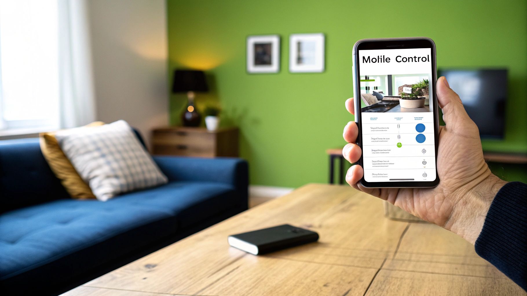
A truly great home assistant mobile dashboard isn't just a collection of buttons; it's a personalized remote control for your entire home. It turns a chaotic list of devices into something intuitive and genuinely useful. Instead of fumbling through menus, a well-designed dashboard puts your most-used controls right where you need them. As a smart home creator, I managed to build my ideal setup using a fantastic visual tool called Dashable, and it made the whole process surprisingly straightforward, with no code required.
Why a Custom Mobile Dashboard Is a Game-Changer
Let’s face it: the default Home Assistant mobile view is functional, but it’s not built for the way you actually live. When I first started on my yoyoKnows journey, my dashboard was an overwhelming mess of entities. I'd scroll past dozens of obscure sensors just to find the switch for the living room lamp. That’s not a smart home; it’s just a complicated one.
This guide is all about moving past that generic layout. We're going to build a dashboard that feels less like a system log and more like a bespoke remote control designed for your family’s daily routines. The goal is clarity and immediate access, not just a digital junk drawer of every device you own.
The Problem with Default Dashboards
The standard Lovelace UI is designed to automatically show you everything. While that's helpful for troubleshooting, it falls short as a daily driver for a few big reasons:
- Information Overload: It displays every single entity, creating a ton of visual clutter you have to sift through.
- Lack of Prioritization: The thermostat you tweak five times a day gets the same screen real estate as a battery sensor you might check once a month.
- Generic Design: It's not exactly inviting. Getting the whole family on board with the smart home is tough when the interface looks like a developer's tool.
My goal was simple: create a control center that even my family would want to use. It had to look good, load instantly, and only show what was immediately relevant. This is exactly where a dedicated builder like Dashable comes in, letting you customize everything without ever touching a YAML file.
Our reliance on mobile control is only growing. The global Smart Home Digital Assistant market was on track to reach USD 6.824 billion in 2025, a number driven by the explosion of connected IoT devices. This trend just underscores how vital a good mobile dashboard is for interacting with our homes.
In this guide, I'll walk you through how I transformed my own yoyoKnows setup from frustrating to functional. We’ll cover everything from planning the layout to some advanced tricks for a polished, professional finish. For more ideas, you can also check out our guide on creating a stunning Home Assistant custom dashboard for larger screens like tablets and desktops.
How to Plan Your Perfect Dashboard Layout
Before you touch a single setting, the most important thing you can do is plan. A truly great home assistant mobile dashboard isn't about stuffing every entity you have onto one screen. Its real power comes from showing you the right controls at exactly the right time. Let's put on our interface designer hats for a minute.
The first question I always ask myself is: what do I do most often? Think about the controls you need to get to instantly, without even thinking. For me, that's my 'Leaving Home' scene, the main living room lights, and the thermostat. I use these multiple times a day, every single day, so they have to be right there at the top.
Identify Your Primary Contexts
Once you've got your frequent-use items sorted, start thinking about context. What you need when you're settling in for a movie is totally different from what’s useful when you're out of the house. I find it really helpful to create separate "views" or pages for specific situations.
For example, my "Movie Night" view in Dashable is super focused. It only shows the media player controls for my TV and soundbar, plus a few dimmable lighting scenes. It completely hides things like the garage door status or my office thermostat because, frankly, they're just noise in that moment.
To get your own ideas flowing, try jotting down a few key contexts from your daily life:
- Good Morning: What do you need first thing? Maybe it's the bedroom lights, a quick weather forecast, and the switch for your coffee maker.
- Away from Home: What gives you peace of mind? This is where door lock status, security camera feeds, and maybe a count of any critical alerts come in handy.
- Evening Routine: What helps you wind down? This could be controls for bedside lamps, smart blinds, and a button to set the next morning's alarm.
A great dashboard anticipates your needs. When you organize controls around your actual life, you transform a cluttered list of devices into an intuitive remote that just works. This is the exact philosophy I used when designing my own layouts.
Prioritizing Your Entities
With your main contexts defined, it's time to decide what goes where. Using a simple framework can make this part a breeze. I like to use a quick table to sort my devices and sensors by how important they are and how often I use them. This little blueprint then becomes my guide when I actually start building in a tool like Dashable, making sure every element on the screen has a real purpose.
To help you get started, here's a framework I use to organize my own entities. It’s a great way to avoid that "digital junk drawer" feeling where you can't find anything.
Mobile Dashboard Entity Prioritization
| Priority Level | Entity Category | Example Entities | Ideal Placement |
|---|---|---|---|
| High | Scenes, Core Lighting & Climate | 'Goodbye' Scene, Living Room Lights, Thermostat | Main homepage, top of the screen |
| Medium | Room-Specific Controls & Media | Bedroom Fan, TV Media Player, Kitchen Lights | On separate, dedicated room pages |
| Low | Status Sensors & Automations | Device Battery Levels, Wi-Fi Status, Backups | On a 'System Status' or admin page |
| Contextual | Security & Specific Scenarios | Door Locks, Camera Feeds, 'Movie Mode' script | On scenario-based pages or pop-ups |
This kind of structured approach really is a game-changer.
If you're looking for a serious head start, grabbing a pre-built Home Assistant dashboard template can give you an amazing foundation to customize. By taking a few minutes to plan first, you'll end up with a design that isn’t just nice to look at, but is genuinely useful day in and day out.
Building Your Dashboard Visually with Dashable
With our plan in hand, it’s time for the fun part: bringing that blueprint to life. This is where we stop theorizing and start building a functional, great-looking home assistant mobile dashboard. My go-to tool for this is Dashable. Why? Because its visual editor completely removes the need to wrestle with complex YAML code, which, believe me, is a massive time-saver.
First things first, you'll connect Dashable to your Home Assistant instance. It’s a straightforward process that instantly gives the editor access to all your devices and entities. From there, we can start crafting our first page. Forget about coding layouts; this is all about drag-and-drop.
Crafting a Real-World Living Room Page
To make this practical, let's build out the 'Living Room' page we planned earlier. Our goal is a focused control panel for everything happening in that specific space.
Here’s how I’d tackle it using Dashable:
- Create the Canvas: In Dashable, the first move is to add a new view and name it "Living Room." This gives us a blank slate.
- Place Key Controls: I always start by dragging in cards for the high-priority stuff. For my living room, that’s a light card for the main ceiling lights and another for the accent lamps.
- Incorporate Media: Next up is the media player. I'll add the card and link it to my living room TV entity. Right away, I have playback, volume, and source controls at my fingertips.
- Display Sensor Data: To round it out, I’ll drop in a sensor card to show the current room temperature and another for humidity. It's great for at-a-glance info.
This entire process takes just a few minutes with Dashable. You can physically see your dashboard coming together as you arrange icons and widgets exactly where you planned them.

The image above really shows how you can use Dashable to create these distinct, purpose-built views by combining different types of control cards into one cohesive screen.
Customizing the Look and Feel
A functional dashboard is good, but a visually appealing one is so much better. This is where you get to inject your own personality into the design.
Using a visual editor like Dashable means you can tweak colors, icons, and card styles on the fly. Don't like the default lightbulb icon? Swap it for something that better fits your aesthetic. Want your temperature sensor to be color-coded based on its value? That’s just a few clicks away.
The ability to instantly see your changes without saving a file and reloading a page is a huge advantage. It encourages experimentation and helps you achieve a polished, professional look much faster than traditional methods.
Even the native Home Assistant experience is evolving to embrace more user-friendly design. In September 2025, Home Assistant introduced an experimental Areas Dashboard designed to automatically generate a mobile dashboard based on the physical layout of your home. This is a significant step because it organizes controls by room—not just by device type—making the whole experience far more intuitive as a smart home grows. You can read all about this innovative feature in the official Home Assistant release notes.
The clean, modern interface you can create with a dedicated visual builder like Dashable makes a huge difference. Notice how consistent icons and clear labels make it easy to identify and control devices at a quick glance—exactly what you want from a mobile interface. This level of polish really elevates the user experience.
Pro-Level Tricks for a Polished Dashboard
Alright, you've got the basics down. Your home assistant mobile dashboard is functional. Now, let's make it smart. A truly great dashboard does more than just give you buttons to press; it anticipates what you need to see and when you need to see it. This is where we go from a static grid of icons to a dynamic, living interface.
My absolute favorite way to do this is with conditional cards, something I lean on heavily in my own setups using Dashable. Think about it: why waste a huge chunk of your screen on a media player that's turned off 90% of the day? Instead, I have mine set up in Dashable to magically appear only when the TV is on. This simple trick keeps your main view clean and ensures the controls you actually need are right there, front and center.
Use Pop-ups to Keep Your Main View Tidy
Here’s another technique I swear by: using pop-ups for anything that requires more than a simple tap. Your main screen should be reserved for the things you do all the time—turning a light on or off, checking the temperature. For the more detailed stuff, like picking a very specific color for an RGB light strip or tweaking a complex thermostat schedule, a pop-up is your best friend.
Imagine tapping a single light icon on your dashboard. Instead of a clunky new page, a clean pop-up appears, giving you everything you need:
- A full RGB color wheel to dial in the perfect shade.
- Sliders for brightness and color temperature.
- Quick-access buttons for your favorite lighting scenes.
This approach keeps your primary dashboard uncluttered but leaves all that deep control just one tap away. It’s a classic design pattern you see in the best mobile apps because it perfectly balances simplicity with power. Setting this up in Dashable is surprisingly easy, and it really makes your dashboard feel less like a clunky webpage and more like a slick, native app.
Creating a Cohesive Look and Feel
A dashboard that looks professional is all about consistency. When you apply a single, unified theme across all your different views, the entire experience just feels more seamless and put-together. This means settling on a specific color palette, a matching icon set, and a consistent font style.
A thoughtful theme elevates your dashboard from being just a functional tool to a finished product you’re actually proud of. It’s a small detail that makes a huge difference in how it feels to use every day.
Integrating live camera feeds is another game-changer. I like to put a small, live feed from my front door camera right on my main page for a quick, at-a-glance check. For other, less critical cameras, I tuck them away on a dedicated "Security" page. This keeps my main dashboard loading lightning-fast.
Finally, one of the best changes I ever made was adding a custom navigation bar at the bottom of the screen. Instead of relying on a standard sidebar menu, I created a few persistent icons that let me jump instantly between my most important views: ‘Home’, ‘Rooms’, and ‘Security’. This one tweak made my home assistant mobile dashboard so much easier and faster for my whole family to use.
Optimizing for Speed and Family Use

Let's be honest, a slick-looking dashboard doesn't mean much if it's sluggish or nobody but you knows how to use it. This brings us to two make-or-break goals for any great home assistant mobile dashboard: pure speed and the all-important "Home Approval Factor." If a dashboard takes an eternity to load or looks like a spaceship cockpit to your family, it’s just not going to get used.
First things first, let's tackle speed, especially when you're not on Wi-Fi. One of the biggest performance killers I've seen are high-resolution camera streams. They’re fantastic, but they don't belong on your primary, most-used screen. Keep your main view lean and mean by reserving it for essential controls. You can always tuck those data-heavy camera feeds away on a dedicated "Security" page.
You also need to be strategic about which entities get constant updates. Does the soil moisture sensor for your fiddle-leaf fig really need to refresh every single second? Probably not. Tools like Dashable are built to be light, but curating your entities thoughtfully is what makes a dashboard feel instantaneous.
Designing for Everyone Else
Getting the performance right is only half the job. The other, arguably more important half, is making your smart home genuinely easy for everyone to use. My personal philosophy is that if someone in my family needs a tutorial to turn on a light, I’ve failed. This is where creating simplified, user-specific dashboards in Dashable is a total game-changer.
I set up a dedicated dashboard just for my family using Home Assistant’s per-user settings. It’s a stripped-down version that hides all the complex automations and system sensors they don't care about.
It gives them just the essentials:
- Main Lights: Simple on/off toggles for the most-used rooms.
- Thermostat: Quick and easy temperature adjustments.
- Common Scenes: Big, friendly buttons for "Movie Night" or "Leaving Home."
This simple setup eliminates any chance of them accidentally breaking something important and makes the whole system feel less intimidating. If you’re setting up a wall-mounted tablet, you can lock it down even further. Check out our guide on how to set up kiosk mode for Home Assistant to create a dedicated, single-purpose interface.
The real win is when your family starts seeing the smart home as a helpful tool instead of a complicated gadget. A clean, focused dashboard is how you get there. It removes all the friction.
This push for household usability is becoming more common. By 2025, the Home Assistant user base had already doubled to serve over 2 million households, showing a clear trend toward family-focused smart home control. The project's roadmap is increasingly prioritizing features that make dashboards easier for everyone in the home to use, not just the resident tech enthusiast.
Answering Your Top Mobile Dashboard Questions
Over the years of tweaking my own smart home for my yoyoKnows projects, I've gotten a lot of questions about building the perfect home assistant mobile dashboard. It can feel like a huge project at first, but I promise it's more approachable than it looks. Let's dig into some of the most common things people ask me.
Can I Create Different Dashboards for Different People?
You absolutely can, and you should! This is one of the best ways to make your smart home work for everyone in the house. Home Assistant’s user system is built for this, and when you combine it with a visual tool like Dashable, it becomes incredibly straightforward.
Think about it:
- For Guests: A simple screen with just the Wi-Fi password and guest room light controls.
- For Kids: An interface showing only their bedroom lights and maybe their favorite media player. No access to the thermostat or security system.
- For You: The "power user" view with every entity, automation, and sensor reading you could ever want.
You can design completely separate dashboards in Dashable and assign them to specific users. It keeps things simple for others and keeps your master controls uncluttered.
Why Use Dashable Instead of the Default Dashboard?
Look, the built-in Home Assistant dashboard is functional. It gets the job done. But if you want something that looks truly polished and unique, you're usually going to find yourself wrestling with YAML code. That's a steep learning curve for many and can be a real time-sink.
This is where Dashable really shines. It swaps out the code-heavy process for a visual, drag-and-drop editor. It’s built from the ground up to help you create beautiful, complex layouts quickly, without ever having to touch a line of YAML.
Frankly, it's why I recommend it to anyone who values their time and wants a custom mobile setup without the headache. You get to focus on the fun part—the design and usability of your home assistant mobile dashboard—not on getting the syntax just right.
Will My Dashboard Work When I Am Away from Home?
Yes, provided you have remote access to your Home Assistant server set up. Your mobile dashboard is just a window into your smart home's brain. If your phone can connect to that brain over the internet, your controls will work from anywhere in the world.
The simplest and most secure way to do this is with the official Home Assistant Cloud subscription (most people know it as Nabu Casa). It’s a paid service, but it handles all the complicated security and networking stuff for you in just a couple of clicks. Once that's running, any dashboard you build with Dashable will work just as well from a coffee shop as it does from your living room.
Ready to stop wrestling with YAML and start building a beautiful, intuitive mobile dashboard? Dashable provides the visual tools you need to create a stunning interface in a fraction of the time. Check it out and transform your smart home experience at https://dashable.app.


